Monthly Archives: August 2014
SYS2 – Graphic Stamps
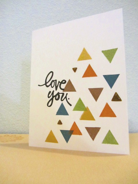
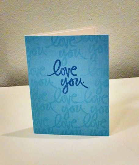
The next lesson in SYS2 is on graphic stamps. Here is my attempt at Debby Hughes’s card:
This stamp is from the Altenew set Socatoah. The ink is an Inkadinkado pigment ink stack that I have had for a while. Shades of blue, like this:
I always wanted to do a project where I used all these ink colors together, and this seemed like the perfect opportunity. In retrospect, I would only use one of the two lightest shades; they’re so close as to make no nevermind between them. Obviously I didn’t use the white ink either.
I added a birthday sentiment — we can all use more birthday cards. It’s from Fresh Squeezed Stamps — it’s the set that has the “You Color my World” sentiment, I found it again.
The little glossy triangles are from Basic Grey. They’re like enamel dots, but — not dots. Enamel shapes, I guess. That I had them, and in that color, is just one of those happy accidents.
The stamps and the enamel dots — er, shapes — are NBUS. Happy that this class is helping me dig into my stash.
SYS – Outline Stamps
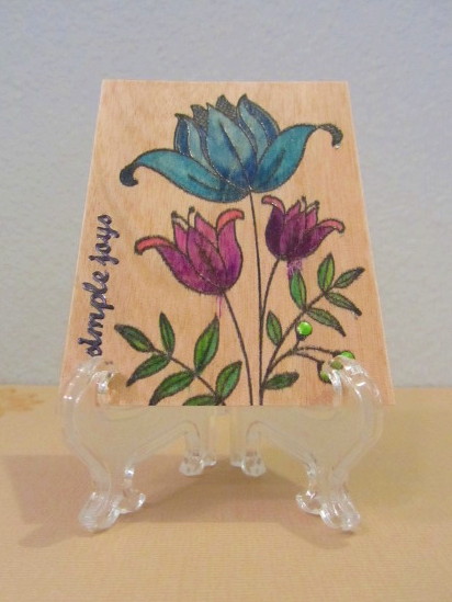
This is my attempt at Debby Hughes’s stamping and coloring on wood project, and it is not great:
The wood here is birch veneer, and it is very porous — even the VersaFine with which I stamped the image bled out. Why did I stamp and emboss in black instead of white? I dunno, just habit I guess. The birch is darker than the balsa wood Debby used, so I used brighter colors. Not sure that was a good call. I used my cheapest alcohol markers, the American Crafts Chromatix. (Which are not good markers, I do not recommend them.) You can see where the purple bled out really badly.
The sentiment says “Simple joys,” and it is a Tiny Words Dazzle peel-off sticker. It was silver, but I colored it black with a Sharpie. Damn, maybe I should have left it silver!
The little buds or berries on the stem are filled with Key Lime Liquid Pearls. Because Liquid Pearls is good at that, and I have so much of it, I need to use it.
The birch veneer and the Liquid Pearls are NBUS.
I was planning to leave this as an Artist Trading Card, but it occurs to me just now, that if I stick it on a card with some busy patterned papers, its deficiencies might not be so evident. I don’t know, I have to think about it.
SYS Background Image 2
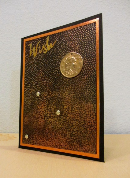
One of the techniques in Stretch Your Stamps 2 is using Perfect Pearls on a “Reverse” background stamp — one that has a lot of solid area. Turns out I don’t have many stamps like that , but I did find this one that has some solid area, in a way —
This background stamp is called “Gradation,” from Impression Obsession. I love those Cover-a-Card stamps — they really do cover a card! 🙂 As you can see the dots go from more thickly clustered at the bottom to more spread out at the top.
I had to completely re-do this card from the get-go, because I had screwed up the measurements the first time, and the stamped and mounted panel wouldn’t fit on the card base! I couldn’t figure out any way to cut it down and use it. But it’s OK, because I think the stamping and the Perfect Pearling came out better this time. Also I didn’t handle it as much, and I sprayed the Pearls with a fixative, so when I was done it wasn’t as smudgy as the first.
The Perfect Pearls colors I used are Perfect Gold, Perfect Copper, and Heirloom Gold. The sentiment is a Dazzles peel-off sticker. It was originally silver but I colored it gold with Staz-On metallic gold ink. I messed up the placement of the sticker a little, but I ended up liking the whimsical nature of it.
That little coin doo-dad is just a piece of swag from an ephemera pack from SEI, from their Mirelle line. Fixed on with Glossy Accents. The little gold dots are Hero Arts Metallic Decor.
Except for the black and copper foil cardstock and the Perfect Pearls, everything else on this card is NBUS. Darnell would be proud of me!
I’m pretty pleased with this one. I think it would make a good birthday card for a man who doesn’t like too much of a fuss on his birthday.
Studio Calico class, card 2
Here’s another card I made for the Studio Calico class.

This card uses elements from the June Studio Calico Card Kit, which is called Penny Arcade. I signed up for the Studio Calico kits when Jennifer McGuire ran a special on her blog, getting the first kit for only ten dollars. I may not renew the kits after the initial six-month commitment, we’ll have to see. But that was too good a deal not to try them out. Each kit comes with an original clear stamp set, so that is something.
I like the card. When I saw the paper and the ribbon, it was clear to how I could use them together. The pink paper, 6×6, was not big enough to cover a 5×7 card, but I cut it apart and hid the gap behind the ribbon. Unfortunately, you can see the divot between the pieces of paper behind the ribbon — I thought the ribbon would have been thick enough to hide it. I should have filled it with a strip of plain cardstock. Ah well. That sort of attention to detail separates a good cardmaker from a great one.
Studio Calico “More Bright Ideas” class
Whilst taking the Online Card Class, I happen to be taking another class at Studio Calico as well, called “More Bright Ideas.” It’s about new ways to use the products in your stash, yay! I signed up for them at different times — they just happen to run concurrently. It’s taught by Nicole Samuels.
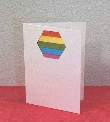
The first lesson is about using ribbon and fabric. The project given was a scrapbook layout, and I don’t really do that. Also I don’t use ribbons or notions on my cards much, as needle-crafting is not one of my other crafts. But I have a few, and there’s no reason I can’t put some ribbon on a card:
I have a pack of American Crafts self-adhesive ribbon. The project in the class involved laying fabric down like a swatch of patterned paper behind a die-cut aperture. So, I lined up some of the ribbon under a hexagon window punched from a card. This is the second attempt — I completely botched the first one. It was all going fine until I completely screwed up laying the die-cut panel over the ribbon layers. That’s the worst, when you screw up at the last step.
Not quite sure what sort of sentiment to use here. If I ever found a sentiment shaped like a hexagon, that would be super-cool. This will probably be a card I hold onto until the right time arrives, and I’ll add an appropriate sentiment then.
Sorry the picture is so grainy — I took it with my phone. My phone’s camera has been acting up lately.
Stretch Your Stamps 2 — Background Images
The first kind of stamp we were working with in the Stretch Your Stamps class was background stamps. Fun! I think there’s two kinds of stamps a cardmaker can never have enough of — background stamps and sentiment stamps.
This card is uses a version of Tasnim Ahmed’s technique of fussy-cutting and using portions of larger background stamps.
I cut out and layered progressively smaller sections of this background stamp. I didn’t raise them up on dimensional adhesive — this stamp is so elaborate, I thought it would be too much. I added a little dot of Avocado Green Liquid Pearls to the center of the medallion, to finish it, and bring the color of the outer portion into the center. I always add a gem or pearl or glitter glue, or something, to the center of a medallion to center and ground it.
Those of you have been following the blog for a while may recognize this stamp as the Basic Grey Spice Market stamp I bought when I won a gift certificate on the Simon Says Stamp Wednesday Challenge blog. (I did a haul video, heh.) First time I used it. Looking at this card, I think this stamp is so elaborate, I could just stamp it all by itself on some different colored cards, and it would make a nice set of all-occasion note cards for a gift.
The paper is from a DCWV 6×6 pad called “Weathered Aspect.” There is a nice tone-on-tone distressed quality to the papers that it turns out you can’t quite see under this elaborate stamp, but I still like the soft colors.
Oh, I stamped it with VersaFine Onyx Black, to get good coverage and fine detail.
SYS2, Day 3
CASEing and cheating
LOL, this is my first card for the new Online Card Class, Stretch Your Stamps 2, and it is pretty much a total cheat. Only the sentiment is a stamp!
The stamped piece Kristina Werner made for her first cards, an intricately colored background stamp, reminded me strongly of a sheet of patterned paper I had in my stash. So I decided to just use that paper! Because it fit, and I wanted to contribute something, but it’s late, and I don’t have the stamina tonight for a session of intricate stamping and coloring.
This card is similar to Kristina’s second card, which had a wide strip of the stamped and colored sheet, and a black die-cut sentiment. I don’t have any die-cut sentiments (yet), so I used a strong sentiment stamp instead.
The patterned paper is from Basic Grey, and the stamp is Technique Tuesday. Both are NBUS. The blog is “Crash Your Stash,” right? 🙂
I am working the late shift all this week at work, so I may not have a chance to do much for the class until the weekend. But I wanted to do something.
Faux Watercolor with Distress Markers
OK, I have been fiddling around with these cards for a while, and last night I finally finished them. (Well, mostly finished.) The technique here is faux watercolor stamping with Distress Markers. Similar to what I have been doing before — coloring the stamp and misting it, but with the markers.
This first one I stamped on kraft paper, because I was curious how the faux watercolor technique would look on kraft paper, which is pretty absorbent. Also I thought it would suit the sketch and color scheme I was planning. I colored, misted, stamped, and left the image to dry naturally. I had to try this out a few times to get the right balance of colors on the wheat ears, so they would stand out properly. The colors I used are Scattered Straw, Dried Marigold, Peeled Paint, Shabby Shutters, maybe a little Vintage Photo or Walnut Stain, I don’t quite remember.
I scribbled the markers on the craft sheet, misted them, and added some splatters with a paint brush, too. That did not work out quite as well as I would like — I’m not great with splatters. They’re OK, but they could be better.
The sentiment is from Fiskars. Once it was all done, it seemed to need something more, so I dug around in my stash and found these tiny, decorated brads. They certainly fit the color scheme.
This second pair of cards are the Seasonal Distress Markers on an ikat background stamp.
First generation impression is on the left, second on the right. As usual, I ended up liking the second generation more, but the first is fine too.
This paper is the Tim Holtz Distress watercolor paper — I like what a bright white it is. I used the smooth side. I mounted the panels on black cardstock for contrast, and added a vellum strip for a sentiment.
I had a certain sentiment stamp in mind — “You color my world” — but I can’t find the damn thing. Hah, I guess that’s what I get for cleaning up! When it turns up, I will stamp the sentiment strips. Or if I find I want to use the cards for something, I will add an appropriate sentiment. I think they would make good low-key birthday cards, being colorful but not too fancy.
So that’s faux watercolor.
There are many other watercolor techniques I could try, but you know, right now, I’m just not feeling it. The watercolor. The unpredictability of it is hard for me. I know watercolor is terribly popular right now, but I think I’m ready to move on. I can always come back to it later.
For my next projects I might like to work with patterned paper. Or maybe play around with some of the non-card materials in my stash.
