Some more ATCs, made with Distress Stains.
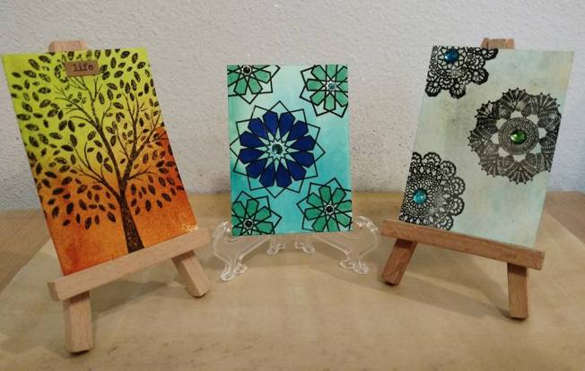
Some more ATCs, made with Distress Stains.
Hello all.
I’ve found a new (to me, anyway) stash-crashing style challenge blog. It’s called the Retro Rubber Challenge, and the challenge is to use your old stamps — stamps that are older than one year. You can read the rules here.
They rotate between Sketch, Color, and Theme challenges, and you have two weeks to play along.
This is a good challenge because many of us get so hung up on buying new, new, new stamps and sets that we forget all about the older ones that we used to be just as enamored of. We buy a stamp thinking, well, I’ll be able to use it forever, but we seldom do. We move on to new acquisitions. Craft hoarding and acquisitiveness is a real problem among crafters, I think, why is why I started my blog in the first place, to combat that tendency in myself. I hope it has helped some of you as well.
Here is my entry in their current challenge, which is a sketch challenge:
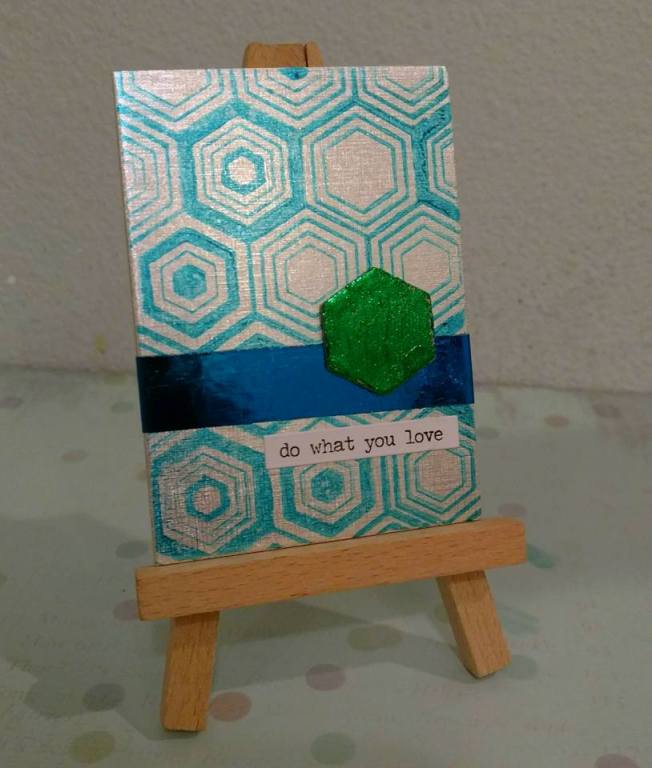
The focal piece in the sketch is a circle, but I thought, why not a hexagon? I love hexagons, such a balanced, pleasing shape. Once I had that idea the card came together pretty quickly. I’ve enjoyed doing the ATCs, so I’m continuing with that.
The stamp for the challenge is the background, the Hero Arts Hexagon Background. And the first time I posted about it was in May 2014, so it is definitely more than a year old. I used Deco Foil for the embellishments. I love Deco Foil! And a Tim Holtz sentiment sticker. An appropriate sentiment, because I love papercrafting, and right now I love ATCs.
Wish me luck! In the challenge, I mean.
Supply List
Crescent Cardboard Mixed Media ATC blank, silver
Hero Arts Hexagon Background stamp
Staz-On Teal Ink
hexagon chipboard, unknown (Maya Road?)
Recollections double-sided adhesive sheets
Glossy Accents (adhesive)
Green and Blue Deco Foil
Tim Holtz Small Talk sentiment stickers
Here is my last ATC, squeaked out on May 31:
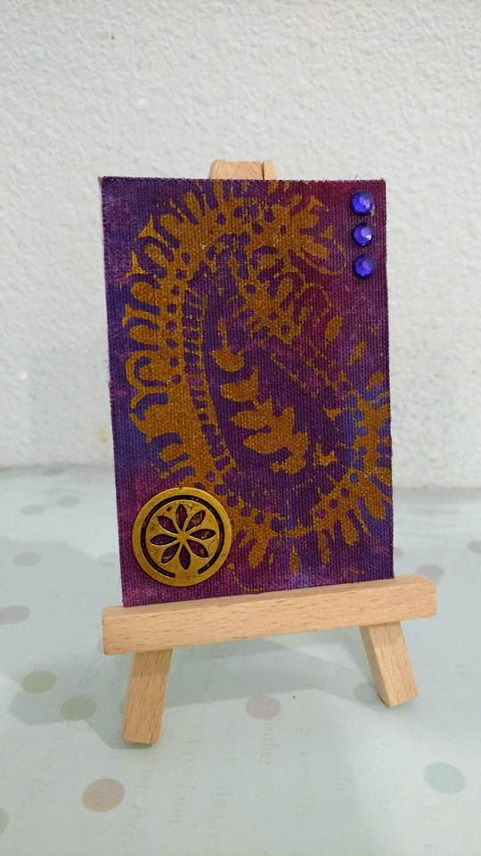
My unconscious tribute to Prince? I’m still sad about his death. He was still young. He died not of a drug addiction, but inadequate pain management. Shocking that even a fortune in the nine figures can’t buy you good healthcare in this country.
Well, anyway, I named it “Paisley Park.”
This is an acrylic paint resist technique. The substrate is Ranger Sticky-Backed Canvas. I thought it needed support, so I mounted it to illustration board. The woodblock stamp was stamped in Tarnished Brass Distress Paint, and the Distress Stain over it is a mix of Shaded Lilac, Seedless Preserves and Dusty Concord.
The woodblock stamp and the metal embellishment are from Michaels/Recollections, their “Boho” collection. The rest of the stuff is just from my stash. None is NBUS, sadly.
So I ended up doing 29 ATCs in 31 days. Didn’t quite meet the challenge, but good enough, I’d say! It’s been fun. I’m going to continue to do ATCs for the time being. I have enough greeting cards stashed for now. I’ve been trading some of them with people on Facebook. That’s fun too.
Here are the three ATCs I created over the weekend.
I wanted to do a Zentangle card during the challenge. The card base is pre-cut Bienfang illustration paper — it’s pretty thin, really just paper, you’ll want to back it with something. I liked the way my Zentangle snaked up the middle of the card, so I decided to just shade in the edges. I used my CG1 Copic for that and it worked well. This paper is meant to take markers anyway.

The Zentangles I used were, from the top, Tripoli, Lichen, Moonwalk, Printemps, and Hollibaugh. Plus some random doodling. I’m not great at Zentangling, but I hope to get better.
For this challenge, I wanted to use some of my ATC blanks in unusual materials. This next card is made of wood, Birch wood veneer. They’re from Creative Imaginations, who make, or made, a lot of ATC stuff at one time. The cards have an adhesive back, so you can mount them on greeting cards or scrapbook pages, or whatever you want.

The daisies stamp is from Stampendous, and I stamped it in Versamark and heat-embossed it with Zing! Opaque White powder. It’s a little blurry — you’d probably want to use fine detail powder if you have it.
I then colored it in with Copics — R81, RV13, G02, YG06, Y35, YR12, YR68. (See, I remembered this time.)
It’s good, but I can’t decide if it needs something more, or not. Some bling — but that might just overcomplicate it. I’m letting it be for now.
The next card is made from sheet metal!

The card blanks are thin, silver metal — aluminum, maybe? — from Imagine Crafts. I saw them featured in a video from the CHA show 2014, and finally tracked some down. This is the first time I have used them (NBUS).
Here, I colored the card with alcohol inks, ran it through an embossing folder, and then sanded it to remove some of the color and highlight the design. The alcohol ink colors I used (from Ranger) were Citrus, Juniper, Stream, and Sail Boat Blue. The embossing folder is from Provo Craft, from an Asian set I have.
Again, I think it needs more, but I don’t want to clutter it up. Any suggestions?
So far I have made 28 cards in 30 days. I’m two cards behind. If I keep it simple, I should be able to finish two more cards tomorrow and complete the challenge!
Here are the cards I made today:

Aren’t they pretty? I was trying to go for a look of semi-precious gemstones like lapis lazuli or malachite.
I used Copic markers on glossy cardstock. I added some streaks of silver leafing pen to imitate veins of metal in the stone. Then I embossed the cards in the WRMK “Gemstone” Next Level Embossing Folder to get the stony facets. I have been wanting this embossing folder for a while, so I finally got it. I added a sentiment to one, but for the second one, I thought, no, let it be what it is.
Not sure they really look like stone, but I like them anyway.
Supplies:
Ranger Glossy Cardstock
Copic Markers, random blues and green (sorry, forgot to note down the specific colors)
Silver Krylon leafing pen
We Are Memory Keepers “Gemstone” Next Level Embossing Folder
Tim Holtz “Small Talk” sentiment stickers
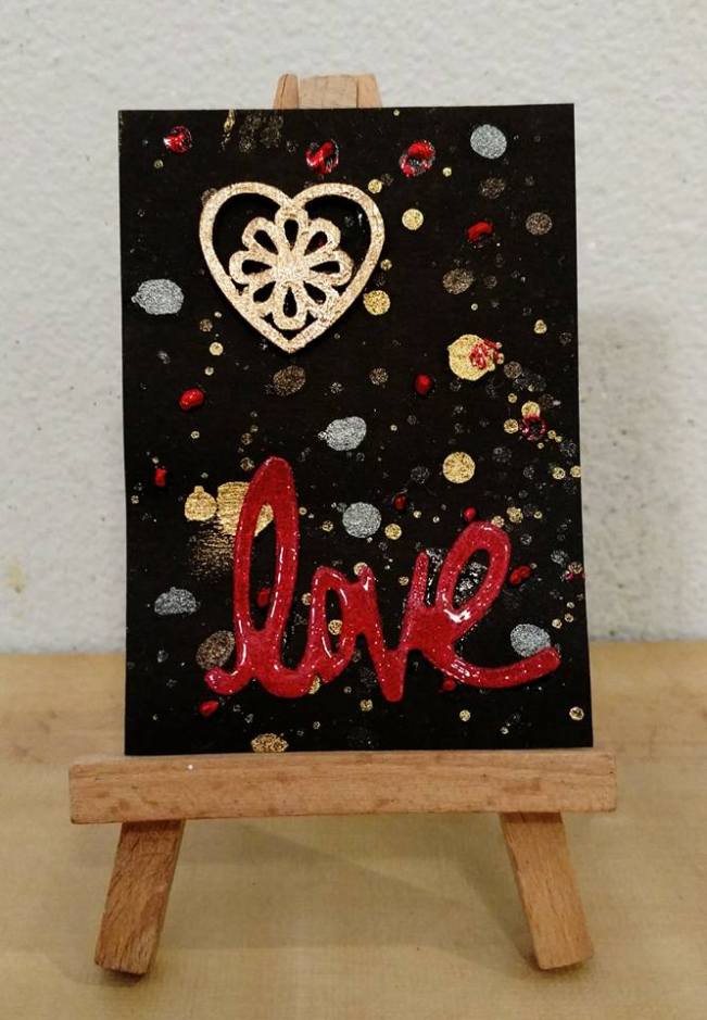
This is my latest. It’s not great but it’s done. I’ve had this “love” diecut sitting on my desk for quite a while — it was intended for a spectacularly failed Valentine’s card. So I finally decided to do something with it.
I spattered the black cardstock with Dazzling Diamonds Glimmer Mist, Heidi Swapp Gold Color Shine, and Viva Pink Glimmer Mist, which you can’t really see — it faded into the black cardstock. I also added some dots of glue and foiled them with red Deco Foil.
I was surprised and annoyed to discover I don’t have any gold Deco Foil (seriously, how did that happen?) so I foiled the wood veneer heart with Rose Gold Minc foil. It looks much more glittery and metallic in real life — it’s hard to get that on camera. As does the “love” diecut, which is red glitter paper covered with Glossy Accents. The camera is pretty unforgiving here.
So, that’s that. On to the next one.
I saw a video of a crafter called Justine Hovey mass-producing some ATCs with Distress Ink backgrounds, here. I quite liked them, so I thought I would do that as well for my next batch of cards, as well. I haven’t played around with my Distress Inks in a while, so I thought that would be fun.
It was pretty fun. Some of them turned out really well, and some, not so well, but none of them are terrible, so far.
Here they are:

I did ten, like Justine, a nice round number. The card bases on these are a mix of Bienfang and Strathmore Bristol paper, and Ranger Specialty Stamping Paper. None were great — the Bristol paper didn’t blend so well, but the Specialty Stamping Paper, which is a matte clay-coated paper, really resisted the inks and stayed wet and smudgy for quite some time. I ended up with a lot of dirty thumbprints and off-color smudges, which I worked hard to blend out. I don’t think they’re all that visible, but I know they’re there! That kind of sloppiness really aggravates me. But the Distress ink just stayed so wet on the paper, it was hard to work with. I stamped the focal images with VersaFine Onyx Black, and that stayed wet for a long time too. In fact I had to lay them out to dry overnight and shut my office door to keep the cats from jumping up and smudging them. (My cat Isis likes to lay on my crafting desk, even though she knows full well she’s not supposed to.)
The little word stickers are from the Tim Holtz “Chit Chat” and “Small Talk” sets that I have been using lately. Chit Chat is individual words, Small Talk is brief sayings.
And since it’s me, I had to bling most of them up a bit. I can hardly let a card rest without some rhinestones, enamel dots or glitter glue.
Let me break it down for you, what is what, starting from the top left:
So, obviously, some of these are more successful than others. But that is part of the point of ATCs — to experiment and try new techniques, materials, without fear of commitment to a major project. And also, I filled one-third of my quota for this project in one go. Not bad!
My favorites are 1, 2, 7, 8 and 10. Which is yours?
I had an idea for a card, and I ended up making three iterations of it, to see which was the most freaky and surreal:

This weird little eye stamp is from an NBUS Inkadinkado Stamping Gear set called “Doodle Fun.” I had the idea to stamp it several times, and just color one in. I got this technique from one of the Online Card Classes. You can see the first card I made with this technique here (my old blog).
I started with the card on the top left: I was going to color the whole thing in, but I started with the iris, and thought just having that colored, looked striking. You can’t really tell in the picture, but I also covered it with Glossy Accents to give it shine.
I then tried coloring in the whole eye, the card on the top right. Then, coloring in all of the irises, and leaving the rest uncolored. I wasn’t sure which would be best. I don’t have much formal art training — one class in high school — so I don’t know much about composition, color theory, or any of that. I work intuitively, I just go with what feels right. I move elements around on a page, change colors, until I get that feeling of balance and completion. I don’t always get it right. But often I do, I think.
In the end, I think I like the first one best — that that one pop of color, a sliver of a higher reality, peeking through into our drab and monochromatic plane.
But I will keep them all. I will catalog them as a series, and call it “Eye-llumination.” I know it’s stupid, but I do have a fondness for lame puns as titles.
Which one do you like best?
Well these cards are not great, but they are done.

The stamps are from an Inkadinkado set called Fancy That, which I got on clearance at Marshall’s, or I would not have bought it. I was rummaging through my unused stamps, and these images looked about the right size for an ATC. I colored them with Staedtler Triplus Fineliner pens. Which I would not recommend! The Fineliners are not made for coloring — they have super-fine tips, and the ink doesn’t move much, so you have to scribble around and around, and the image comes out scratchy. If you get what I’m saying. They are really more writing pens, good for journaling and Zentangling.
Anyway, I did the top one first. I wanted it to have a fun rainbow vibe, but it just looks disorganized. I restricted the color palette on the second one to blues and greens, and I think that works better.
They really needed something besides the doodle starkly colored on the white Bristol paper, so I sponged them both around the edges with Distress Ink: Spun Sugar for the top, and Tumbled Glass for the bottom. It did help to ground them.
Both the stamp set and the pens are NBUS. I’m really making a dent in my uncrashed stash with this ATC project!
Haven’t decided what to call them yet. I may go back and try to pretty them up a little bit; I may not. Any suggestions?
Here is the other card I made last night:
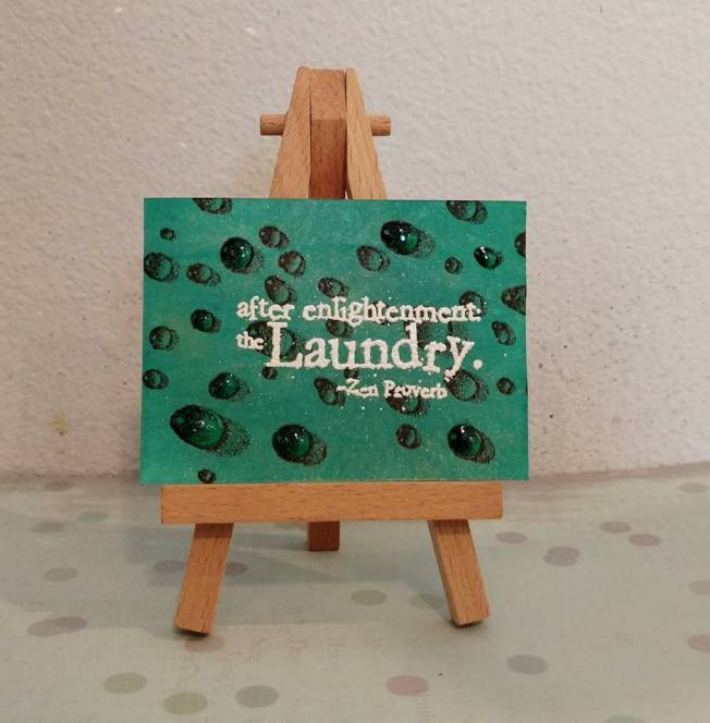
The background was done with color sprays, and the much beloved Water Droplets stamp by Designs by Ryn. The sentiment is from Impression Obsession, and I have had it for a while. I put it in my Use-It Box for this project. So, yay! Using the Use-It box.
I highlighted some of the water droplets with Glossy Accents, just for fun.
Both stamps are NBUS. Now I can retire them from my “to-be-used” bag and into my stamp storage.
Supplies:
Bristol Board pre-cut ATC blank — My Art-C
Color Sprays:
Distress Cracked Pistachio
Dylusions Calypso Teal
Tattered Angels Verdigris Glimmer Mist
Stamps:
Water Droplets — Designs by Ryn
After Enlightenment — Impression Obsession
